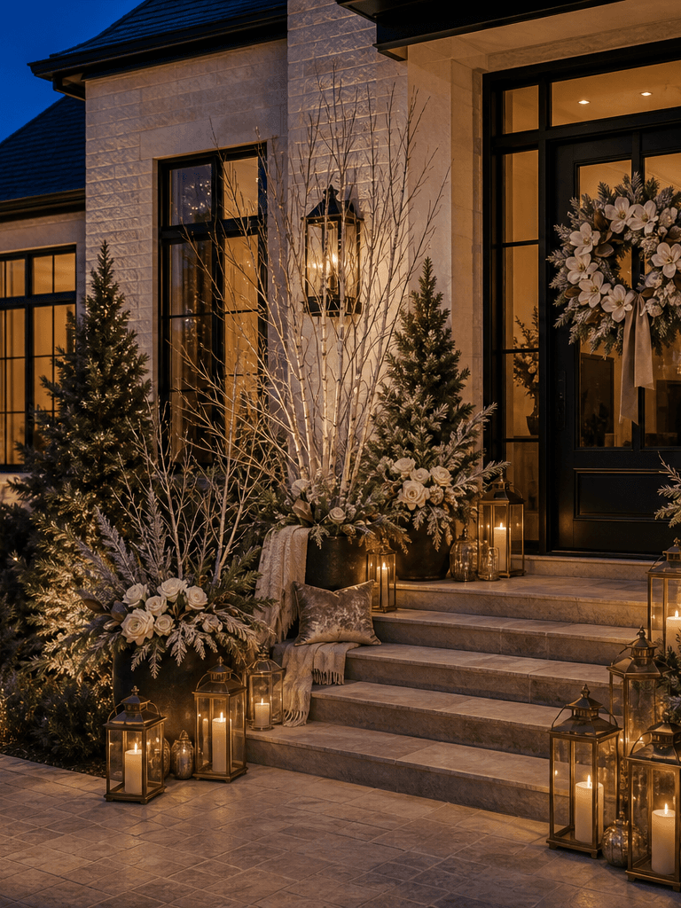
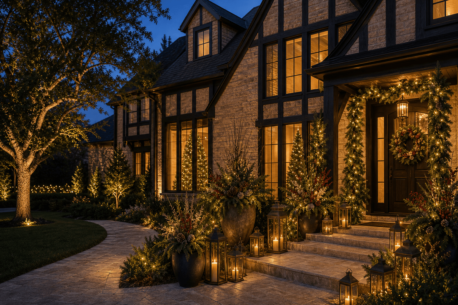
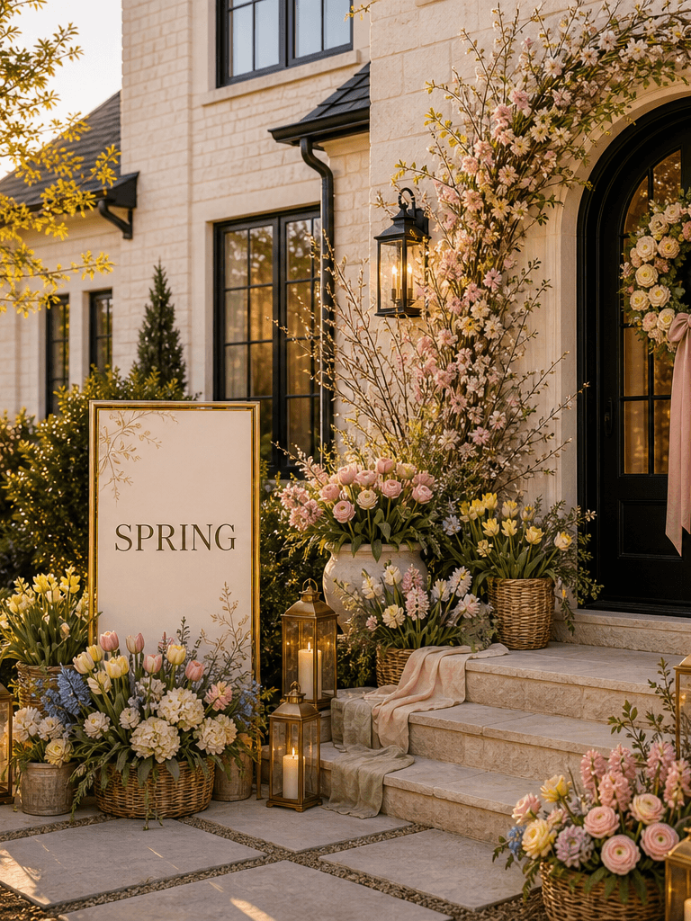
Arbor & Ember
Our brand identity system, media kit, and usage guidelines. Everything you need to represent Arbor & Ember with accuracy and care.
Concepts Under Review
Multiple logo directions exploring different relationships between the arbor and ember halves of the brand. Each takes a different approach to the ampersand, typography, and visual weight.
Playfair Display wordmark with an illustrated italic ampersand. Organic branches grow from the left curve, ember glow radiates from the body. The ampersand is the hero — it doubles as the standalone icon mark.
Cormorant Garamond Light with no illustration. ARBOR in cream/forest, the italic ampersand in gold, EMBER in gold-light/deep-gold. The color split alone tells the brand story. Minimal, elegant, lets the typography breathe.
Vertical stack with ARBOR over EMBER. The italic ampersand sits centered between thin gold rules, acting as a divider. Works well as a square format for signage, packaging, and social avatars. More formal, more structured.
Circular monogram with the illustrated ampersand inside concentric rings, paired with a stacked Outfit wordmark. More modern, more geometric. The monogram separates cleanly as an icon. The sans-serif type is a departure — cleaner but less editorial.
No ampersand at all. ARBOR and EMBER separated by a tiny leaf-and-ember motif — two small leaves and a single glowing dot. Maximum restraint. The brand mark is the space between the words. Reads like a high-end hotel or architecture firm.
Weight contrast as the design device. ARBOR in bold uppercase anchors (the structure, the arbor), while “Ember” in light title-case floats (the warmth, the glow). The weight difference itself tells the brand story — solid meets soft. More editorial, more fashion-forward.
Every Word Means Something
Our name isn't decorative — it's a direct map to our palette, our services, and the two halves of what we create.
Together, Arbor and Ember describe the full experience we create — natural beauty intertwined with warm atmosphere. The & isn't just punctuation. It's the brand mark itself — the bridge between structure and glow.
The Living Ampersand
Our wordmark centers on an illustrated italic ampersand — organic branches grow from its left curve while a warm ember glow radiates from its body. The two halves represent the duality of our brand: natural beauty meets warm atmosphere.
Clear Space
Maintain a minimum clear space equal to the cap-height of the “A” in ARBOR around all sides of the wordmark. Never crowd the logo with other elements.
Misuse
Do not rotate, distort, recolor, or add effects to the wordmark. Do not separate the ampersand from the type. Do not place the logo on busy or low-contrast backgrounds.
The Standalone Symbol
The illustrated ampersand works independently as a favicon, social avatar, embroidery mark, and watermark. At very small sizes (below 24px), simplify to the italic ampersand with a single leaf.
Simplified to italic ampersand + one leaf at 16–32px
Full illustrated ampersand with ember sparks on forest circle
Gold thread on forest fabric — leaves in cream thread
Forest, Gold & Cream
Our palette maps directly to the brand name. Forest tones represent the Arbor half — organic, grounded, structural. Gold tones represent the Ember half — warmth, glow, atmosphere. Cream is the neutral canvas that lets both breathe.
The Duality Principle
Every application of color should reinforce the arbor/ember tension. Forest anchors, gold illuminates. Use gold sparingly — it should feel like catching light, not flooding it. The palette reads best when forest dominates and gold punctuates.
Two Voices, One System
Nn Oo Pp Qq Rr Ss Tt Uu Vv Ww Xx Yy Zz
Cormorant Garamond
All headlines, hero text, and large display typography. High-contrast serifs mirror the brand duality. Primarily used at Light (300) weight, with italic for emphasis and accent phrases.
Nn Oo Pp Qq Rr Ss Tt Uu Vv Ww Xx Yy Zz
Outfit
Body text, UI elements, navigation, buttons, and supporting copy. Clean geometric sans-serif provides contrast with the elegant display font. Used across 300–700 weights.
How We Sound
Our voice is confident but warm, design-forward but approachable. We speak with authority about our craft without being pretentious. We're the neighbor who happens to have impeccable taste.
You Celebrate.
We know our craft. No hedging, no apologies.
Friendly, human, never clinical or corporate.
Speak to aesthetics, composition, and intention.
Make premium feel easy, not exclusive.
- "Designed to complement your home, not compete with it."
- "Curated, cohesive, intentional."
- "You'll be proud to have this in your front yard."
- "Full-service — we handle every detail."
- "Cheap" or "affordable" — we say "accessible" or "flexible pricing"
- "Decorations" alone — we say "displays" or "installations"
- "Simple" — we say "effortless" or "streamlined"
- "Best in Dallas" — we let the work speak for itself
Downloads & Assets
Logo files, brand assets, and press materials for media coverage, partnerships, and co-marketing. All assets include usage guidelines.
Logo Package
Wordmark, icon mark, and lockup in SVG, PNG, and PDF. Light, dark, and monochrome variants.
Color & Type Guide
Full color specifications (HEX, OKLCH, RGB) and typography guidelines with usage examples.
Press Photos
High-resolution installation photography approved for editorial and media use.
Brand One-Pager
Single-page overview with logo, colors, tagline, and boilerplate — ideal for quick reference.
Voice & Tone Guide
Messaging frameworks, approved language, and editorial guidelines for written communications.
Social Templates
Figma templates for Instagram posts, stories, and Facebook covers using our brand system.
Need Something Specific?
For custom asset requests, partnership inquiries, or press materials not listed here, reach out and we'll get you exactly what you need.